Chapter 1 - Structured Data & Visualisation
In this chapter we'll introduce the concept of data science. We'll then look at some very simple structured data and see how traditional analysis is performed with Excel. We'll then look at how to perform these same operations using Python - a programming language that is highly popular with data scientists.
Each chapter will then build on this baseline and introduce more advanced concepts, more complex data, and more sophisticated methodologies to extract insights from this data.
What is Data Science?
Data science is the study and application of the mathematics, statistics, computer science and technology relating to data. This can be as simple as aggregations over data (such as a sum or a standard deviation) - or as complex as the theory and technical implementation of AI systems.
This book teaches a set of practical concepts and applications of data science by introducing increasingly complex data sets and the techniques that are required to derive more powerful insights from this data.
Introducing a Basic Dataset
We'll start our journey with one of the most simple ways to apply Data Science - how to analyse a simple dataset. This task will likely be very familiar if you have ever worked with any kind of table of data in a tool such as Excel.
Let's start by introducing some data (which we will expand upon as we go through this book) and then take a look at how we might extract some simple insights from it.
| Order ID | Date | Amount (USD) |
|---|---|---|
| 1001 | 2023-10-01 | 15.00 |
| 1002 | 2023-10-02 | 25.00 |
| 1003 | 2023-10-03 | 30.50 |
| 1004 | 2023-10-04 | 12.75 |
| 1005 | 2023-10-05 | 18.20 |
This table represents orders to an imaginary online bookstore. Each row of the data has an identifier that represents the order, a date and an amount. This data is structured.
🧠 Structured Data
Structured data - follows a well-defined pattern and is organised. For example, a table is structured. It is broken up in to columns that define specific categories or attributes, and rows that define specific values. A good way to know if your data is structured is to ask yourself the question "can I analyse this data without having to first process it in any way?".
Unstructured data, by comparison, is data that requires processing to be able to analyse it. For example, a set of printed invoices would be unstructued data. These invoices contain data, but work would be required to extract it into a form that we can work with perform operations on.
This dataset is tiny and highly simplified! As the book progresses we're going to deal with much larger and more complex data. We'll also introduce a lot of data that is of very poor quality and potentially dubious provenence, which will give us much more realistic examples to work with!
Visualisation in Excel
A basic example of the application of data science at this point could be to try and answer the following questions:
- How can I visualise this data?
- What is the total value of my sales?
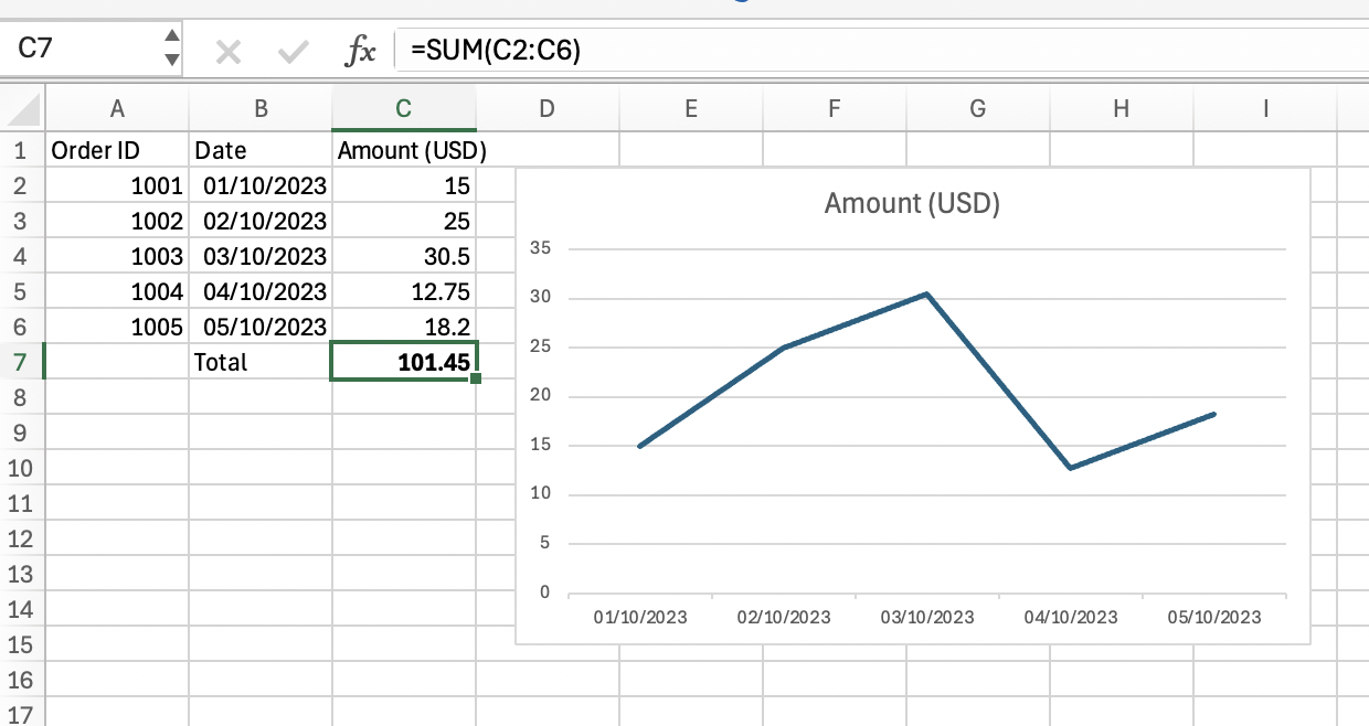
Questions like this can be easily answered with a tool like Excel - which is why it has been so popular over the years. It is quick and easy to drop this data into a spreadsheet and use a function like a 'sum' to look at the total sales.
It is the work of a few minutes to paste this data into an Excel workbook and add a 'sum' to the data. Instructions are below if you need some help and want to follow along.
How to create this workbook
- Copy the table shown above.
- Open Excel
- Paste the data into the workbook
- Click the cell beneath the last order value
- Enter the text
SUM- now select the cells that contain the order values - Select the date and order value cells
At this point we've answered our questions and managed to get some basic insights:
How can I more easily visualise this data?
A simple graph such as a line chart allows us to easily visualise this data. At a glance we can see that we have an order with a similar value each day.
What is the total value of my sales?
We've used a 'sum' function over our data to calculate the total sales - 101.45 dollars.
If you are following along purely with the concepts only and do not want to learn how to perform this analysis in Python (or you are already familiar with how to do so) you can move to the next chapter, where we'll look at predictions through linear regression.
Next we'll see how to use the Python programming language to perform a similar analysis, read on. This will be a great way to learn to very basics - which we can build upon from here.
Introducing Python for Data Analysis
Python is a programming language that is well suited to data science. Some reasons it is so popular are:
- Its syntax is simple and intuitive
- Its reasonably simple to install and run
- Its engineered in a way that makes data analysis reasonably fast and efficient.
- There are a wide selection of 'libraries' that are available that provide many useful features for data analysis, visualisation and so on.
- There is a large body of knowledge to draw upon, such as books, articles and websites
These features make Python quick to learn and flexible enough to be applied to simple or complex problems. As you use it more you'll discover many other reasons for its popularity.
Now let's get started with how to use Python to analyse this data.
The Juypter Notebook
As Python became more widely used, not just by programmers but by data scientists, analysts, business users and so on, the Jupyter Notebook technology became a popular way to work with data.
A Juypter Notebook is combination of data, code, visualisation and text that can be interacted with. The technology and ecosystem is so widely used that we can safely use the generic term 'notebook' from this point onwards.
Notebooks allow you to create a 'narrative' around your analysis - you can describe what you want to do in plain text, write code to perform analysis, visualise results, write up insights and so on. You can create a highly accessible story around your data.
If you have never used a notebook before, there is a short video at Appendix - Your First Notebook section.
I encourage you to watch this video and follow along to see the basics.
We will use notebooks extensively in this book as they make it much easier to explain what we are doing step-by-step. You can open the notebooks shown on this site without having to install Python or setup anything on your machine.
The notebook below contains our data and our analysis. You can click on the notebook or this link to open it in your browser:
You can see output similar to the Excel workbook shown above. Feel free to explore and experiment - we'll be breaking it down in the next section.
Let's take a look at this notebook section by section.
Introduction & Loading the Data
First we have a title and summary - this is what makes notebooks great - you can tell a story!
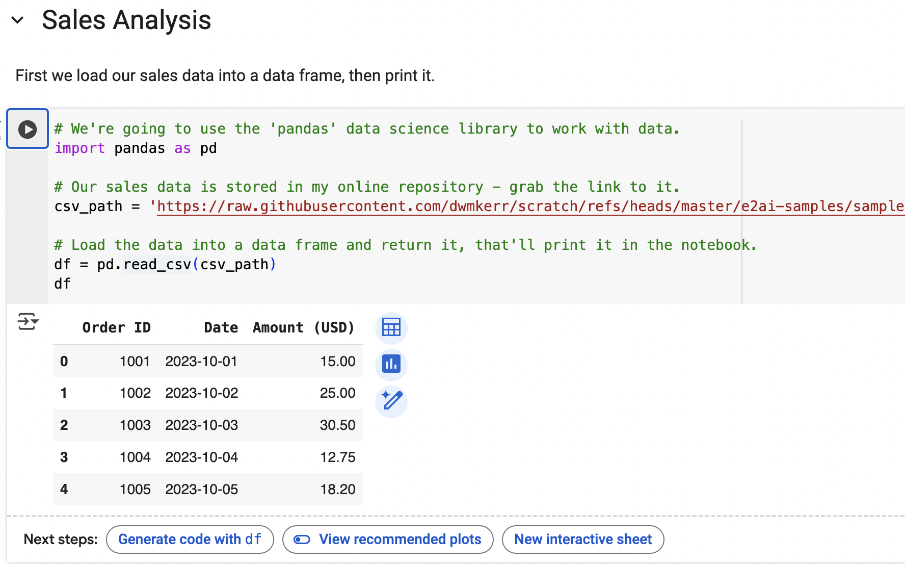
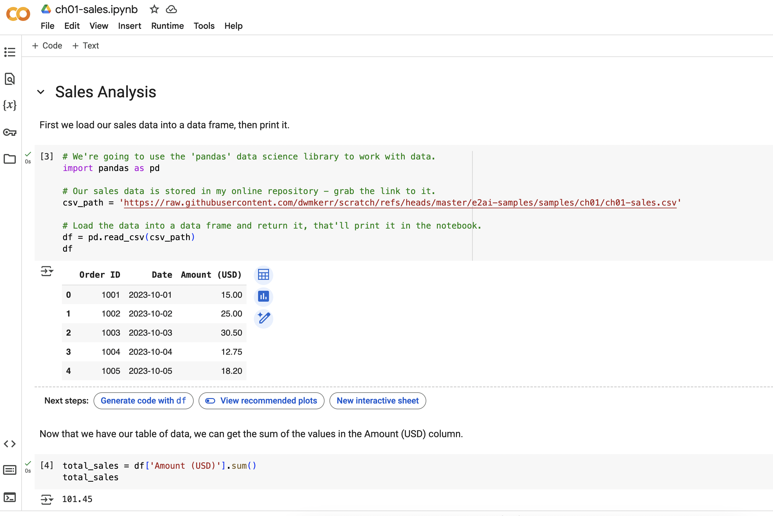
We use some Python code to load our Sales Data (which is in a CSV file stored in my repository) into a data frame - which is like the Python equivalent of a table. We're using the pandas data analysis library. A library is a collection of Python functions and tools that have been bundled together. Here's what the first part of our notebook
First we tell Python that we want to use the pandas library - and that we'll refer to it with the name pd (which is a little quicker to type!):
import pandas as pd
Next we load our CSV data into a dataframe:
csv_path = '.../ch01-sales.csv' # path shortened for brevity!
df = pd.read_csv(csv_path)
The result of the last statement in a code block will be shown to the user, so we'll just show our data frame:
df
That's it! You'll see the table printed in the notebook. If we were to execute this as 'raw' Python code on a machine the data frame would still be loaded, but we wouldn't see it. In the notebook we can see it, sort it, filter it and so on. This is where notebooks shine.
Summing the Data
Now we provide a little more explanation text, then have another code block to sum the 'Amount (USD)' column.
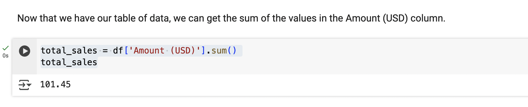
Our code looks like this:
total_sales = df['Amount (USD)'].sum()
total_sales
Don't worry if the syntax is not familiar, there are many resources online that can help you learn the Python (and pandas) syntax, we're going to keep this to a brief overview only.
Plotting the Data
We finish the notebook with some code that uses the matplotlib library (a very popular library for visualising data) to show a graph of Sales against Time:
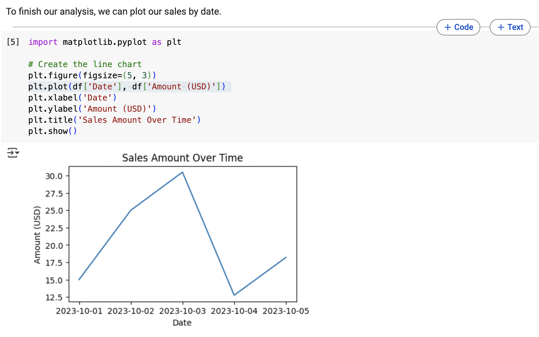
This code is a litele more involved, as we're specifying the labels for the axes and so on.
Experimenting with the Notebook
I encourage you to play with the notebook - press the 'play' button next to each block in turn, try and edit the text, perhaps even change the code. This book is not going to teach every part of the Python language and how it works, but it'll give strong samples for you to use as a basis for your learning and discuss each concept as we introduce it.
Our code samples will get more and more advanced. To help you learn I'll try and recommend resources at the end of each chapter that will help you solidify your learning if much of this is new to you.
Summary
In this chapter, we introduced the following key concepts:
- Structured Data
- The Python Language
- The Juypter Notebook
In the next chapter we'll look at how we can analyse our data to make predictions about wat we might expect in the future.
Resources & Further Reading
If you would like to deepen your understanding of any of these topics I recommend:
- W3Schools: Python Getting Started - a great tutorial on how to install Python, understand the basics of the syntax, write and execute your first program
- W3Schools: Introduction to Data Science (and Jupyter) - an excellent introduction to data science that then quickly shows how to install Juypter and run your own notebooks
Sample files for this chapter:
| Resource | Description |
|---|---|
| ch01-sales.xlsx | The sales data spreadsheet |
| ch01-sales.csv | The sales data CSV file |
| ch01-sales.ipynb | The sales data Juypter Notebook |